Tuesday, 30 June 2015

Week 14: Proposal

After most of the designs are done, it is time to start on the proposal's content. We each type some parts of the proposal and compiled them to be printed. 


Typing some contents for the proposal

Separating the merchandise to be placed in the microsite


Finalized band logo designs:


Finalized painting of Forest animals:


Friday, 26 June 2015

Week 13: Sketchup

I'd never thought I would use Sketchup for this degree program. But for this assignment we have to use it to design the on-ground promotional event for our festival.

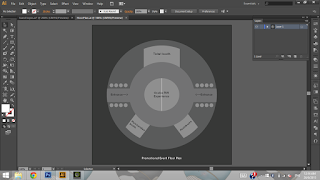
This is the finalized floor plan to be followed in Sketchup.


I downloaded the software and tried to build something. Not very fond of going through instructions first, I find it quite confusing but at the same time entertaining. Initially I thought we have to design and built everything on our own, but actually we can get ready made models from a 3D warehouse.

I was actually trying to build my own structures from scratch, like the stage for example. It took such a long time and I wonder if I can actually finish everything on time.

I refined the floor plan, showed Mr Michael and he helped me download a few models from the Warehouse. 

I arranged the models according to the floor plan and made modifications to them.

For the merchandise cashier counter I duplicated the cash register.

Also added clothes to an empty rack. 
(Even managed to replace the design with my own!)

Initially I wanted the photo booth to be enclosed but with suggestions from my lecturer I decided to make it open so that the rest of the mall-goers can see what's going on. 

I added props and customized backgrounds from the microsite.


My lecturer also mentioned that there should be more logos added to the event site to sell the brand more. I wasn't sure about that idea at first because I thought the place looked overcrowded with logos.
But then a trip to KL via an LRT filled with Rexona's logos made me realise that in real life it doesnt look weird at all. 

Because the event in located in the US, we of course couldn't fly there to take pictures if their malls. It was also hard to find pictures of their malls in the right angle. Therefore, I suggested to my lecturer that I will take pictures of our local mall Sunway Pyramid and pretend that it is in the US. 


I managed to find an almost empty concourse with 3 elephant sculptures.


Tuesday, 23 June 2015

Week 12: Event Timeline & Floor Plan

We have to plan an event timeline from 4 months before to the day of the concert itself.  As concert-goers and band/artist page followers on social media, we have some brief ideas on when to release the posters, billboards, and other forms of promotional items. 

The on-ground event, which is going to be an Oculus Rift experience was inspired by an event held in Sunway Pyramid to promote History Channel’s new television show called ‘Alone’. Participants enter the tent, wearing an oculus rift to see animations of the forest in the dark. But for Woodland Wonders, participants will see a forest with colourful laser lights and beam lights.


Sketch of the timeline.

Sketch of the oculus rift.


The initial floor plan had only two entrances, 
but was later corrected for more crowds to enter.

This is the corrected floor plan with a stage added for mini performances by 
a few bands who will be performing on the day itself.

A mock up of the facebook page was designed to show how it will look like.


This the finalized timeline:


Week 11: Microsite Illustrations

After the confirmation of the information architecture with our lecturer we proceed into task division and started doing our part. We review each other's work as a group during tutorial sessions with our lecturer and gave suggestions for improvements. 


Initially, the merchandise design like the apparels were just plain navy colour 
with the logo on it. This was because I thought of keeping it plain and simple. 
Then however, Mr Michael suggested that it needed more neon colours to match the 
microsite and the look of the event which includes laser lights, beams lights, and etc.

The ticket went through a lot of design changes due to some reason that it kept looking too feminine, like a 'Barbie doll's'. It was probably due to the colours that I chose. 

Most of the band logos for the microsite are self designed because I wanted to take this opportunity to do some logo design (maybe it could be used for other projects in the future). We also exchanged logos with our classmate's band (Project White) and obtained the lovely Tupeyst and Whale's logo to make an appearance as well. 

Lighting and colours were adjusted for the beautiful backgrounds that Hannah painted which were also used for a number of other items such as the promotional poster, ticket, on-ground event designs and more. 


I couldn't resist but to paint the forest animals instead of taking it from the internet because I really love to do character design. It didn't consume much time and it was also quite stress relieving.


Tuesday, 16 June 2015

Week 10: Microsite IA

This week we were asked to focus on our microsite's information architecture. I thought it would be best to keep it as straight forward and simple as possible. After further discussion, we agreed to also add a mini game in the microsite. The game requires users to spot and click on some forest animals who will appear and disappear randomly while they are browsing the site. At the end of the page, users will be shown their score and they get to redeem a prize. 


This is the basic structure of the page:


Monday, 8 June 2015

Week 9: Microsite Moodboard

We were suggested by our lecturer to look up examples of the scrolling idea we proposed. I found a site which was similar to what we wanted to do and took note of how the layers blur out as they move closer. 


Next we discussed on the look and theme of the event. The vector and paper cutout idea from the poster assignment was given a rest and we went with digital painting style. Our lecturer suggested that we take images from the website to use as our background but we couldn't find the images that we want to represent our concept. 

Here are some of the inspirations:


The colour scheme for this event will follow the poster's from the previous assignment which is mainly navy, magenta, cyan, turquoise, and violet. I used Adobe Color as a fast way to select, create and save a colour scheme.